This project started with an early-stage edtech startup focused on supporting nonprofits and educational institutions in helping students navigate their path to college. With a small team, limited resources, and a basic MVP in place, their goal was to strengthen the product to support growth and attract investors.
They came to Diveria with a six-month roadmap of features to build. However, after an initial assessment, we identified key UX challenges, fragmented navigation, and brand inconsistencies impacting both usability and product perception.Through a short discovery phase, we worked closely with their team to align on vision, real needs, and opportunities for improvement.

.png)


The process began with a discovery phase that helped us align with the client’s needs, better understand their audience, and clarify the core values the product aimed to convey. We also explored visual directions and the product’s guiding metaphor —the “North Star”— as a foundation for building a more cohesive experience.
In parallel, we conducted a heuristic and UX audit that uncovered key challenges in navigation, features that lacked clarity, and flows that required additional support, such as structured onboarding and an initial product tour for students.
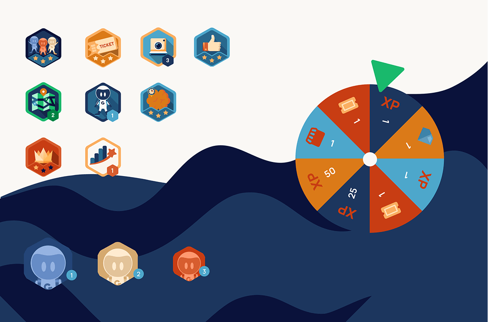
With these insights, we moved into validating visual concepts and redesigning existing features, while introducing new elements like Starcharts, onboarding, and a guided product tour. This was followed by implementation, where we also addressed multiple bugs and made backend adjustments to support a more scalable and consistent product.
.png)
Through a workshop with the team, we explored product goals, audience, and the brand’s core concept and visual metaphor, along with benchmarking analysis.
This helped us better understand the product and establish a clear foundation for UX and design decisions.
We analyzed the mobile app and web platform to assess the overall UX.
We identified navigation issues, inconsistent use of patterns, features lacking clarity, and strong visual inconsistencies across the branding.
We established a consistent visual foundation through a unified color palette, typography, iconography, and illustration.
This enabled a more cohesive and modern identity across the entire product experience.
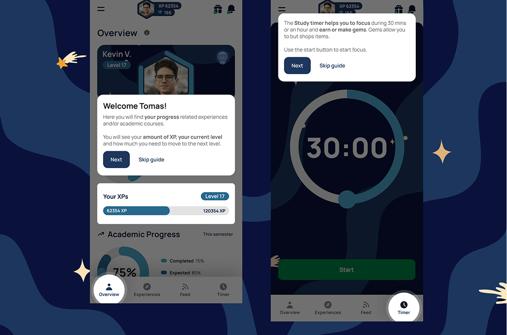
Based on audit findings, we redesigned the app’s navigation and overall experience.
We restructured the architecture, introduced more modern patterns, and improved flows to create a clearer and more consistent experience.
We introduced an interactive product tour using tooltips to guide users through key features, with step-by-step navigation and skip options.
This replaced the initial manual guidance and enabled a more intuitive, self-driven onboarding experience.
We designed a question-based onboarding flow to profile users and assign them a Starchart aligned with their goals.
This enabled a more personalized experience from the start, guiding each user based on their profile.
We collaborated in defining the different Starcharts and how they shaped each user’s journey within the app.
This helped structure experiences, activities, and goals tailored to each profile, supporting habit-building.
We addressed multiple bugs and improved overall product stability.
We also strengthened the technical foundation to support growth and scalability.
The redesigned Figma mockups were implemented in development along with new features.
Components were standardized, resulting in greater visual consistency and improved user experience.
